What is Typography?

Roshanak Keyghobadi | January 2015

Typography has been identified in a number of ways and its definition has gone through changes throughout the history of design based on aesthetic, cultural, social and technological ideas and transformations.

Friedrich Friedl, Nicolaus Ott and Bernard Stein (1998) in their book Typography: An Encyclopedia of Type Design and Techniques Throughout History state: “the 20th century brought change to all areas of art and culture. The legacy of past centuries was consciously forgotten to make way for the new. Art saw the transformation from representational to abstract painting. Unfamiliar images were greeted with vehement enthusiasm and rejection alike before they were accepted as an expression of a society under radical change. This in turn changed ideas of harmony, form and proportion. Typography, which had changed little since Gutenberg and then only in conformity with a rigid pattern of rules, was also embraced by these new concepts. In the past it had been a steady medium which served reading and writing; now suddenly began to move.”(p. 8)

Rob Carter, Ben Day and Philip Meggs (2002) in Typographic Design: Form and Communication also highlight the changes in the function and definition of typography since the early twentieth century. They explain: “the typographic message is verbal, visual, and vocal. While typography is read and interpreted verbally, it may also be viewed and interpreted visually, heard and interpreted audibly. It is a dynamic communication medium. In this sense, early twentieth- century typography becomes a revolutionary form of communication, bringing new expressive power to written word.” (p. 74)

Laszlo Moholy-Nagy (1923) in his essay titled “The New Typography” explains: “epigraphy is a tool of communication. It must be communication in its most intense form. The emphasis must be on absolute clarity since this distinguishes the character of our own writing from that of ancient pictographic forms” . In 1971 designer Herbert Bayer describes typography as “a service art, not a fine art, however pure and elemental the discipline may be.”

Later Philip Meggs (1992) clarifies that, traditionally, the word typography meant the technical process of printing writing through the use of metal types with raised letterforms that could be linked and printed in a process not unlike a rubber stamp. In our electronic age, typography encompasses the transmission and communications of alphabetical and numerical information through a variety of means, including printing, video transmission, computer display, and electric signs.  What Meggs is describing is the evolving nature of typography and its essence and meaning. In a sense typography is no longer about the metal type or typeset matter but it is as James Craig and William Bevington (1999) explain, “the art of designing with type.”

Also, Kees Broos (1982) in the essay “From De Stijl to New Typography” proposes: “let us define the word “typography” here as the deliberate use of letters, in the broadest sense of the word. The user can be printer, typographer, architect, poet or painter. The materials are not restricted to those of the type case or typesetting machine, but encompass every suitable medium from linoleum to electronic news marquees and from a tile tableau to television. It is important that the user be aware of the shape and function of each letter and consequently of the expressive potential in the design and arrangement of letters and text opened up to the reader and the viewer.”

The definition of typography and the space that it creates for layers of meaning and interpretations are continually expanding and shifting. As Rick Poynor (1991) in his essay “Type and Deconstruction in the Digital Era” explains: “contemporary typographic works embody multiple readings, encourage readers’ participation and are becoming complex.” Poynor states: “type design in the digital era is quirky, personal and unreservedly subjective. The authoritarian voices of Modernist typography, which seem to permit only a single authorized reading, are rejected as too corporate, inflexible and limiting, as though – it may be forlorn hope – typographic diversity itself might somehow re-enfranchise its readers…The aim is to promote multiple rather than fixed readings, to provoke the reader into becoming an active participant in the construction of message. Later Modernist typography sought to reduce complexity and to clarify content, but the new typographers relish ambiguity, preferring the provisional utterance, alternative take, and delayed punchline to finely honed phrase.”

Jessica Helfand (1995) in her essay “Electronic Typography” draws the attention to the performative and dramatic nature of contemporary typography and asks: “What happens when written words can speak? When they can move? When they can be imbued with sound and tone and nuance and decibel and harmony and voice? As designers probing the creative parameters of this new technology, our goal may be less to digitize than dramatize.”

Another factor that influences the evolving definition of typography is who is defining it and in what cultural context it is defined. For example the complexity and openness of the definition of typography sometimes creates anxiety and unease among artists and designers.

Currently in the Iranian design scene one of the heated topics of conversation and criticism is typography and its definition. Although typographic activities such as siyah mashq (even if they are not recognized as typography) have long been practiced in Iran, yet typography is confronted as a new phenomenon that is overpowering every aspect of the graphic design. In 2006 Ebrahim Haghighi (2006) in his essay titled “Poster Mania” puts forward several questions about “the emergence of a new form of art called typography.” He states: “it is not clear whether it is painting or sculpture, graphic design or photography, cinema or video art. It may encompass all or may be independent and self sufficient with its own set of principles and techniques. Does every work produced by calligraphy, penmanship or fonts classify as typography? How can we distinguish that it is not a work of graphic design or painting? By which rule or principle has this new labeling been defined? ”

Other Iranian designers have expressed their understanding and definition of typography as well. Morteza Momayez (2004) explained: “typography is not merely the design of the letters. In today’s world there are a number of different definitions for typography. We cannot even say that typography is design with script or letters, because in some instances in the hands of a typographer or type designer or a layout artist, it creates an atmosphere that visualizes the written concepts.”

Mohammad Ehsaei (2010) separates writing and calligraphy from typography and explains: “when we say typography, at once typing letters come to mind. You are typing the letters that have been pre-designed for specific needs and goals. Delicate letters are designs for delicate concepts and rough letters for bolder purposes…Therefore we have typography, calligraphy and writing. Each has a different function, form and aesthetics. Nowadays all of these are presented in form of what is called a font and the common mistake is to call all of them typography. Calligraphy can never become a font. A calligrapher sits down and creates a calligraphic work and if a nastaliq font is designed it is not calligraphy anymore. When a letter or a word is designed for a logo and is not going to be used for other typesetting purposes, it is not called typography. For example when you look at Herb Lubalin’s Mother and Child logo it is not typography it is graphic design…Calligraphy is the mastery and skill that is embedded in calligrapher’s hands and anything that the calligrapher creates on the paper is personal and would be for the first and last time; just like writing.”

In his essay titled “What is typography?” Saed Meshki (2004) states: “the most important, and at the same time, the most challenging function of typography is to create by letters and words an ambiance capable of conveying to the viewer something of the essential character of the subject, and also something of the graphic designer’s feelings about the subject and his or her grasp of it. Letters and characters are a set of signs that by virtue of their familiarity impart to the viewer something more than just an exercise in pure form even if they are not legible in a typographic composition. Because of their characteristic shapes, Persian letters and words are imbued with energy of their own. It is by the correct exploitation of this latent energy of Persian letters and by discovering the aesthetic criterions that apply to them that Persian typography is distinguished from Western typography.”

Reza Abedini (2010) defines typography as: “any activity by a graphic designer to give letters and writing a visual meaning beyond information…There is a major problem with trying to define typography. When you ask what is the definition of typography it is like asking what is the definition of computer, and in addition you want to know what is Iranian typography? There is no such thing. If we want to talk about computers, Iranians have no role in its creation. They may like to translate its name to Persian and call it Pardazeshgar to feel better but this does not change anything about the nature and function of the computer. Well, it is the same story with typography. Basically typographic activities are meaningful in Western visual art specifically in Western graphic design…What I mean is if I want to be seriously working on Persian calligraphy and Persian letters it is not necessarily called typography anymore. Using computer as an example again, I should create a device, which can solve my [an Iranian person] problem, because computer has solved the problem of a Western person.”

Masoud Nejabati (2004) stated: “in my view typography is giving sensitivity to letters. If we agree that every graphic design work is made of two basic elements of type and image, the quality and validity of what is written is based on typography. Which means that type has been changed from its usual form. If letters are endowed with sensitivity then a typographic work is created either in concrete form or abstract form.”

Homa Delvaray (2010) states that: “typography has a wide definition and I can not fit it in one sentence, but what comes to my mind is when we consider specific qualities of letters in a work and emphasize that aspect it becomes typography. It is in reality a graphic design style, which people choose to use and it can be objective or subjective. If they look at typography objectively, they transfer the meaning by objective means and if they chose to use is subjectively and in abstract context, they use letters as codes. It all depends on the designer’s taste…When we concentrate on each letter and position them in a space in order to create a composition, it becomes a typographic work.”

In conclusion, I believe that the most contemporary and relevant description of typography is what design critic and educator Ellen Lupton has put forward which is “the art of designing letterforms and arranging them in space and time.” Lupton (2000) explains: ” Typography is going under water as designers submerge themselves in the textures and transitions that bond letter, word, and surface. As rigid formats become open and pliant, the architectural hardware of typographic systems is melting down.”

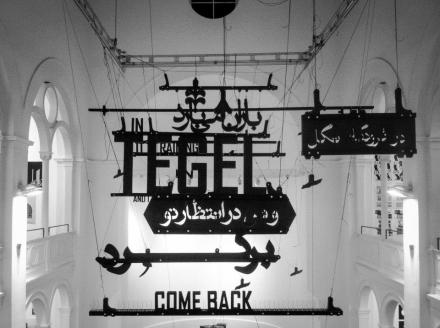
Artworks by: Shahrzad Changalvaee, Reza Abedini, Farhad Fozouni, Homa Delvaray, Iman Raad and Mohammad Ehsaei.

© Roshanak Keyghobadi, 2015. This essay cannot be reproduced, quoted, translated or published in part or as a whole in any format without Roshanak Keyghobadi’s permission.


Without a Face: Six Iranian artists and six portraits

By: Roshanak Keyghobadi | March 19, 2014

صورت من صورت تو نیست , لیک… 
جمله توام , صورت من چون غطا
صورت و معنی تو شوم چون رسی
…محو شود صورت من در لقا 
مولانا

Art historian Shearer West (2004) describes portraitures as “aesthetic objects,” with “pragmatic and symbolic function.” West also explains that: “self-portraiture by its very nature engages in some way with artistic identity, but how that identity is represented and perceived is heavily influenced by the status and gender of the artist at different periods in history.[i]

Historically in Iranian miniature paintings humans have been depicted as ideal figures and portraitures were two-dimensional with minimal hints of chiaroscuro.  In the Safavid era (1501–1736) Reza Abbasi created a new genre in painting by enlarging and depicting single characters, which were more realistic and with individuality; and Sadeqi Beg has apparently “painted thousands of marvelous portraits.”[ii]

According to Priscilla Soucek (2000): “as the popularity of portraiture grew, there appears to have been a parallel evolution in writing about it that explored the connection between an image’s external appearance and its inner significance…by the late sixteenth century the Safavid poet and painter Sadeqi Beg can claim that the outer form (sura) of his portraits had almost been able to portray a person’s (mani) or inner essence. He also claims that some paintings are so lifelike that all they lack is speech.”[iii]

In the Qajar era (1785–1925) when new European painting techniques and photographic imagery were introduced to Iranian artists they started to explore other ways of visual representation. Aydin Aghdashloo (2005) observes that in the Qajar period Iranian painting gradually distanced itself from the realm of spirituality and imagination and sought to depict the moments of mortal and worldly pleasure and focused more on the subject matter. Aghdashloo believes that: “technically Qajar paintings possess a magical and rich quality, intelligent composition, brilliant colors, innovative ornamentation, and skillful portrait painting (shamayel negari).”[iv]

In contemporary Iranian art practices portraiture has been a popular genre and photographs of Bahman Jalali (Image of the Imagination)[v], Maryam Zandi (The portraits)[vi] and Newsha Tavakiloian (Look)[vii] as well as paintings of Aydin Aghdashloo (Occidental)[viii] and Simin Keramati (Self Portraits)[ix]; and silkscreen prints of Khosrow Hassanzadeh (Prostitutes)[x] are few examples.

In general portraits act as signifiers and they can carry cultural and social codes which represent politics of class, gender and power. One of the most important elements of traditional portraiture is depiction of the facial features, which can provide visual clues for deciphering ones identity or can act as internal or external narratives. But what happens if a portrait lacks facial features or the face is not obvious?

In the six portraits by six contemporary Iranian artists (Reza Abedini, Sadegh Tirafkan, Shadi Ghadirian, Samira Alikhanzadeh, Samira Eskandarfar and Amirali Ghasemi) the “face” is hidden, covered or omitted. Although in all of these artworks it seems that the absence of the face makes the portraits unidentifiable yet they become loaded sites of self-identification and reflection for the artists as well as the viewers.

Reza Abedini’s poster depicts the silhouette figure of himself where the face is covered with a cluster of letters.  When asked about the reason for hiding his face in his posters Abedini explained: “It has been mentioned that I always hide my face. It is true, I never thought about it. It was entirely unconscious. I still don’t like to have a clear image of my face in my posters.” [xi] In this image Abedini has positioned his figure in the center of the format following the composition of the Qajar paintings and photographs. Although his portrait lacks clear facial features, ironically it is the essence of his visual identity and individual expression. Abedini’s portrait is a self-referential image since not only his face is covered with Rezar typeface (that he has designed) but also he has used his silhouette repeatedly to the point that it had turned into his personal mark and logo.[xii]

Sadegh Tirafkan’s self-portrait depicts him holding a sword.  His face and part of his naked body are covered with a Lo-ng, which is a red rectangular cloth that men use in Iranian bathhouses for drying and covering themselves. Tirafkan has explained that the body with the covered face and the sword do not represent aggression but honor and patriotism. He has stated: “sword and Lo-ng are among the most important icons of manhood in Iranian culture. Sword is a defensive weapon rather than an aggressive one and it is used to defend ones dignity and country. In addition to cover a man’s body, Lo-ng is also a symbol of masculinity and humanity to a real man. In ancient Islamic civilization Lo-ng was worn by warriors and it was made of gold and silk threads…I tried to convey the humanistic message embedded in these ancient symbols of manhood in my culture…”[xiii]  By not revealing his face Tirafkan has transformed his self-portrait into an image that can belong to any Iranian man. His body language and gesture of holding a sword suggests heroic pride and empowerment. This can be a figure of a ghahreman or pahlevan (hero or champion) reclaiming his honor without showing his face, as it is customary for a javan mard (righteous man) to perform a good deed or act of kindness without revealing his identity. Tirafkan’s main focus is on masculinity and he is occupied with what he considers symbols of manhood.

In contrast Shadi Ghadiraian’s portrait focuses on womanhood. In her photograph a woman in a chador (veil) with floral patterns has a face that is replaced or covered with a frying pan. Other photographs of this collection portray women wearing various patterned veils with their faces replaced with other cooking or cleaning tools such as a teapot, a colander, a grater, a broom, an iron or a plastic glove.[xiv] Ghadirian explains: “I married my friend and colleague who is a photographer and writer in 2001. As soon as I mentioned marriage my mother started buying things like bowls, plates, iron, etc… and prepared my dowry and sent me to my new home.  Family and friends came to visit and they brought gifts such as broom, ladle, glasses, etc… I thought to myself…what are these things that women have to start their new life with? I stared my married life and used all of those things. I also had new responsibilities. What should we eat? What should we wear? My dual life started from there. For instance I would stir the food and read a magazine at the same time and many more examples such as this. Although I was in better position compared to other women. Because I did photography, traveled and liked my work but I was still responsible for all the housework. I created the series of Like Every Day at that period.[xv]  The objectified woman of Ghadirian’s portrait is a “product” of her culture and society.  Her body is transformed to a decorative figure covered with a wall paper-like chador and her face is transformed to a generic cooking tool. Does any one exist behind the chador and the frying pan? Ghadirian’s woman is confined in multiple ways and addresses the issue of a woman’s social and cultural identity as well as her personal identity.

Similarly the woman in Samira Eskandarfar’s painting is concealed more than once. First she is covered by a mask, which is made to hide her entire face except her eyes and then by her hands hiding her face. Eskandarfar has created many portrait paintings[xvi] yet this portrait is among the very few of her self-portraits with an entirely covered face. She explains: “this was an accidental photo and actually I was pressing my forehead because I had a headache … but I felt that it was an image that I could expand. It is a part of my Mickey Mask series which I created two years ago and is really a self- portrait. In this work the face is not under a mask but hands are covering the face and hiding the feelings. It is related to an inner dialogue and about the human condition.[xvii] Eskandarfar’s portrait delves into more personal yet humanistic and philosophical issues and contemplations. In her portrait Eskandarfar’s face is covered by her own hand and at will. By doing this she creates a barrier between herself and the viewer.  Her fingers with short nails that are painted in black nail polish[xviii] press her forehead, which is wrinkled under pressure. The gesture conveys tension and stress and creates anxiety. This can be the portrait of any woman in contemporary time that is dealing with her own feelings as well as trying to make sense of the world around her.

Samira Alikhanzadeh’s self-portrait is not a portrait of herself. It is painting based on an old photograph of a woman. She is wearing a green blouse pinned with a golden brooch, has long flowing red hair and wearing red nail polish.[xix] Her image and presence evokes feelings of liberation and confidence even though her face is covered under mirrors. Alikhanzadeh explains: “the images I use in my work date to the 30’s, 40’s and 50’s; a period following the banishment of the veil in Iran. By applying mirrors to the surface, I create a marked though incomplete, presence of the viewers within the framework of my composition. I thus make a direct connection between the subjects in the past and the viewers in the present. They in turn become a part of the composition and possible descendants of the subjects, looking into a past, or perhaps like I, satisfying their voyeuristic urge to enter the lives and memories of generations gone by.[xx]  By omitting the original face of the photographed woman, renaming it as a self-portrait and reflecting the viewer’s face in place of the actual face Alikhanzadeh combines and creates multiple spaces of identification and realization[xxi] which travel through time.

Amirali Ghasemi’s photograph focuses on the semiotics of an actual space and social setting. His image depicts a woman in a coffee shop in Tehran. Her face and hands are blanked out except for her lips that are revealing a Cheshire smile. She is wearing  a ring on her left hand finger, holding a cigarette and is wearing a watch on her right hand. Her hair is casually covered with a scarf and her head is resting on her hand. It seems that she is relaxed and looking straight into the camera.  Ghasemi explains: “coffee Shop Ladies is a series of documentary photos I took in Tehran…The faces of the young ladies portrayed in these photos are hidden by a blank space (stickers). By reducing the level of information that each photo can offer to visitors, I wanted to prevent the media from misusing and/or manipulating the images on a mass scale. Nevertheless, the connection with the real characters isn’t lost completely. When Coffee Shop Ladies is presented as part of an interactive program, viewers are free to find out more about the characters by clicking on the blank spaces, then listening to what the ladies have to say. Ghasemi’s photograph makes the viewer aware of the location in which the woman is situated. In a sense the photograph becomes a portrait of the site (coffee shop) rather than a person.[xxii] Ghasemi states:“due to the absence of public places, cafes are a symbol of social freedom in Iran. They are the only places where young people, intellectuals and journalists can interact…” [xxiii] Also in Ghasemi’s photograph the simultaneous presence and absence of the woman in her environment may point to the status of women in contemporary Iran.

Some of the common themes in the six portraits are identity, individuality, representation, negotiation, culture, class, gender and narrative of self and the other. It should be mentioned that each of the six images that were discussed is part of series (posters, paintings, and photographs) and can be studied in relationship to other similar images within its collective to investigate other interpretations and ways of reading. Also there are more artists that have created fascinating portraits with concealed features and faces throughout Iranian art history but at this instant and as a starting point I believe these six portraits make room for imagination and provide ample space for the viewers to interact with them and explore and create their own narratives.

Images from top left to right:

­­

  • Reza Abedini, Persianalite, 2008, exhibition poster, 100×70 cm.
  • Samira Alikhanzadeh, #24 from the Self Portrait series, 2011, acrylic and mirror fragments on printed board, edition of 3 + 1 AP, 140×100 cm.
  • Shadi Ghadirian, #6 from Like Every Day series, 2000, photograph, 50×50 cm.
  • Amirali Ghasemi, from Coffee Shop Ladies series, 2004, photograph, 30×40 cm.
  • Sadegh Tirafkan, from Iranian Man series, 2000, digital photograph, 64×48 cm
  • Samira Eskandarfar, from Mickey Mask series, 2012, painting, 200×150 cm.

© Roshanak Keyghobadi, 2014. This essay cannot be quoted, translated or published in part or as a whole without Roshanak Keyghobadi’s permission.


[i] West, S. (2004). Portraiture. Oxford University Press.

[ii] Basil Gray, Chapter 16(b) in The Cambridge History of Iran (in Seven Volumes), vol. 6, Peter Jackson and Laurence Lockhart, ed., p. 889-900. Cambridge: Cambridge University Press, 1986.

[iii] Soucek, P. (2000). The theory and practice of portraiture in the Persian tradition.

Click to access Roxburgh_Reading1.pdf

[iv] Aghdashlou, A. (2005) Moqademeh-e bar naqashi Qajari [introduction to Qajar

painting], Herfeh Honarmad, 13. In Persian.Tehran, Iran

[xi] Interview with Roshanak Keyghobadi, 2012.

[xv] Correspondence with Roshanak Keyghobadi, 2014.

[xvii] Correspondence with Roshanak Keyghobadi, 2014.

[xviii] Wearing black nail polish can be associated with being Goth, rebellious, complex and contemporary.

[xix] Wearing red nail polish can be associated with being glamorous, passionate, courageous and bold.

Suspended state of thingness: Mehran Mohajer’s photographs of nothing

By: Roshanak Keyghobadi | January 31, 2014

Where film lets us believe in more things,
photography lets us believe more in one thing.
Christian Metz

With no doubt Mehran Mohajer is an influential figure in the history of Iranian photography. Mohajer (b.1964, Tehran) is a photographer, lexicographer[i] and a lecturer in photography at Tehran University. He has written and translated articles in a wide range of subjects from photography, linguistics, and poetry to modern hermeneutic and analysis of debate. Mohajer’s photographs have been in several solo and group exhibitions in Iran, France, Germany, Greece, USA, and Australia.

In November of 2012 Mohajer had an exhibition of his photographs at Tarahan Azad Gallery in Tehran, titled “Nothingness/Poverty of.” I would like to focus on one photograph that belongs to this collection and in my view is a suitable point of entry to Mohajer’s complex and fascinating visual language.

This photo (above) does not have a title.  At first glance it appears to be an extreme close up of a printed matter such as a page of newspaper. Lines of bold type —one on top of the composition and the other on the bottom— frame the image and a bright ultramarine blue plastic ribbon in the center not only divides the image to right and left sections but also brings the top and bottom edges of the image together. Parallel to the blue line and on the right, the paper has been worn out and torn. The narrow tear has created a linear gap on the surface. To the left of the blue ribbon two noghteh (dots belonging to letters above and below) also create a visual line. The whole composition is subtly gridded.

The boldness of the type on top and bottom of the composition is in extreme contrast with the middle section of the photo where it seems to be offering the viewers’ eyes and minds an open white space to rest and contemplate. But upon keener observation the viewers soon discover that this white space is not truly quite and void of any marks. Reversed lines of type in shape of letters, words and sentences and another grid system made of rules and line that are printed in the back side of the paper show through the surface very lightly. Another interaction between typographic elements in the photo also happens in relationship to the two bold and macro lines of type and the two micro letters that peak through the torn gap on the surface of the newspaper.

Attention to the relationship between type and image, language and photography has been at play in several of Mohajer’s collections of images. For example in The light is off the room is dark (2003) and Image, text and money (2006) Mohajer uses newspapers as source of written ingredient for his images. In Migrant Packages (2004) handwriting, in Undistributed Packages (2005) misprinted papers, in Expired history (2006) stamped expiration dates, and in Flags (2004) printed type on fabrics make up the typographical components of his photographs.

In 2008[ii] Mohajer explained the connection between typography and photography in his works: After studying photography I have studied linguistics and since then I have got a split mind!…Therefore my interest in typography is not immanent and is not directed to its very nature. I am interested in the interplay of language and photography as two semiotic systems and the results, which can merge from this confrontation. Then typography is one of the possible manifestations of language itself, but having its own cultural significations.

But what is the relationship between this image and “nothingness”? What is the “poverty of” this image? In a brief and poem-like statement for the exhibition Mohajer (2012) stated that: Nothingness like desire, awareness and love is directed towards something. I don’t know what is this thing? Is it my eye or my mind? Or the outside world? These photos are contradictions that exist in my mind, on one hand I am passionate about photography and on the other I am fed up with all the sameness and “post” condition…so I returned to image/word and tried to reside in the materiality of the image/word and feel and sense this material.  And I touched and saw this nothingness.

Later when I asked him about the “Nothingness/Poverty of” photos he (2014) added: The nothingness series is a result of investigation in the mechanism of the camera and the mechanism of seeing and touching. In this collection I have tried to demonstrate the poverty of photography to its end. (based on Christian Metz’s logic in “Photography and Fetish”). The camera is so close to things, that in many instances the lens touches them. This closeness causes the thing to become separated from its surrounding and its status of thingness becomes suspended.  What is in front of the camera is not a thing in the usual sense (glass negative, photos, TV image, words in a book, or letters in a newspaper).  This suspension has happened twice; when the thing was selected and also when confronted by the camera. Although the subject matter of photographs are things in the material sense yet from a cultural perspective they belong to the realm of representation and they mediate between the world and us.  In fact our experiences of them are in the domain of seeing and thinking but the camera tries to touch them. Whether it is and effort in vain or successful, you can be the judge of that. 

Nothingness is commonly defined as “empty space” “utter insignificance” and also “the state of being no longer seen, heard, or felt”. Mohajer’s attempt to feel the materiality of what he calls “nothingness” and using the camera as the extension of his body to get extremely close to “things” transforms their state of utter insignificance and makes them worthy of seeing and touching. In the process of pausing and taking time to register all the details of what may be called “nothing” in Mohajer’s photographs, the viewer is pleasantly rewarded with unexpected surprises and sophisticated visual and linguistic enigmas. It maybe that Mohajer is hinting at the “poverty of” human perception and mind rather than things and opening up a vista to see something in everything even if we regard it as “nothing.”

©Roshanak Keyghobadi, 2014.  This essay cannot be quoted, translated or published in part or as a whole without Roshanak Keyghobadi’s permission.

Image: Mehran Mohajer, Nothingness/Poverty of series, 2012.

Mehran Mohajer: http://www.tavoosonline.com/SelectedArtist/SpecialEn.aspx?src=133&Page=1


[i] Mohajer holds a BA in photography and MA in General Linguistics.

[ii] From Mehran Mohajer’s e-mail correspondence with Roshanak Keyghobadi, 2008.

Ritual of Recollection: Barbad Golshiri and Mim Kaf Mim Aleph

By: Roshanak Keyghobadi | November 2013

از خاک در آمدیم و…
…بر باد شدیم
عمرخیام

…We were ascended from the soil
and blown by the wind…
Omar Khayyam

It is estimated that around 146,357 people die each day in the world. Some may be buried individually or in mass graves cremated or not buried.  Most burials and mourning rituals bring closure for those who are left behind.

A computerized search on Behesht Zahra’s[i] website provides the exact location of a grave (section, row and number) as well as the information on the tombstone (first name, last name, father’s first name, date of birth and date of death). Family members of the deceased may also add poems and photos (framed or etched) to the tombstones. By marking a location and providing specific information, a tombstone not only becomes a proof for a life once existed on earth and a site for identification but also is a way that family and friends can locate and visit the deceased and become engaged in their ceremonies of respect and remembrance.

Barbad Golshiri’s portable stencil flat iron tombstone masterfully facilitates the ritual of recollection for the family of a man who was denied a tombstone. As it is explained in the catalogue of his recent exhibition at Thomas Erben Gallery[ii],

“The stenciled text narrates the labyrinthine death of a man who for political reasons could never have a tombstone on his grave. His family asked the artist to make a tombstone for him and the artist made an ephemeral tomb for their loved one. Each time the family visits the cemetery they bring along the stenciled tombstone with them, place it on the grave and stealthily pour soot powder on it. The text is thus imprinted and depending on the wind strength vanishes in a few hours or a few days. The act is repeated as a ritual.

The epitaph reads in Persian:

Here Mim Kaf Aleph does not rest. He is dead. Layer beneath layer dead. Depth beyond depth. Each time deeper. Each death deeper. Stone upon stone. Each stone a death. Mim Kaf Mim Aleph has no stone. Has never had. No trace of it [also: so be it]. Never in all deaths. December came and Mim Kaf Mim Aleph was no longer [there]. Is not.”

By denying Mim Kaf Mim Aleph a permanent tombstone in a specific location, his grave (which can now be anywhere, although he is buried in one specific place) becomes an active and mobile site of remembrance and takes on a nomadic life. If the denial of a tombstone was an act of obliteration, the stencil tombstone becomes a tool for visibility, liberation and constant renewal and recall.

The ritual of spreading the soot over the stencil tombstone is reminiscence of the ceremonies of spreading ashes of cremated bodies over land or water, when upon their release ashes disappear in the space and cannot be assembled again. Yet the act of spreading soot on the grave and over the iron stencil gives shape to letters, words and sentences which all describe and point to the fact that this particular site is not an ordinary site and a body is buried underneath. The ritual gives identity to an unidentified grave and the enigmatic narrative transforms the epitaph into a riddle to be solved. Only the family of the man knows the full answer, only they know the details of a life that is no more.

Barbad Golshiri’s The Untitled Tomb can be interpreted based on where it is located/displayed. In the hands of Mim Kaf Mim Aleph’s family it is a private and practical tool for performing their visitation rites. In a gallery space it is a public and aesthetic object standing on its own with no relationship to its original location and context yet with close connection to the other tombstones created by Golshiri in his Curriculum Mortis.
© Roshanak Keyghobadi, 2013.

Image: Barbad Golshiri, The Untitled Tomb, 2012. Iron, soot. 60.5 x 135 x 0.2 cm. Edition of 3 + 1AP.

Also see: http://www.barbadgolshiri.com


[i]Behesht Zahara is the largest cemetery in Iran located in south part of Tehran which was established in 1970. It is around 540 hectares and has close to 1,400,000 graves. http://beheshtezahra.tehran.ir/Default.aspx?tabid=92

[ii] Curriculum Mortis exhibition by Barbad Golshiri was on view at Thomas Erben Gallery in New York from September 7 to October 26, 2013. http://www.thomaserben.com

Composing in Space: Tactile Poetry of Farhad Fozouni

By: Roshanak Keyghobadi | September 2013

Farhad Fozouni is a leading figure in the contemporary Iranian graphic design with an international reputation and impressive list of accomplishments and recognitions. (1) Fozouni dares himself to get out of his comfort zone for the sake of creating new aesthetic experiences and meanings for himself as well as his viewer by creating unique poems. His tactile poetry not only reveals his continuous experimentation and discovery of new forms of artistic expression but also displays his desire to fully engage his viewers by getting them to touch and feel his words/images…

Read more here at Design Observer:
http://observatory.designobserver.com/feature/composing-in-space-tactile-poetry-of-farhad-fozouni/38096/